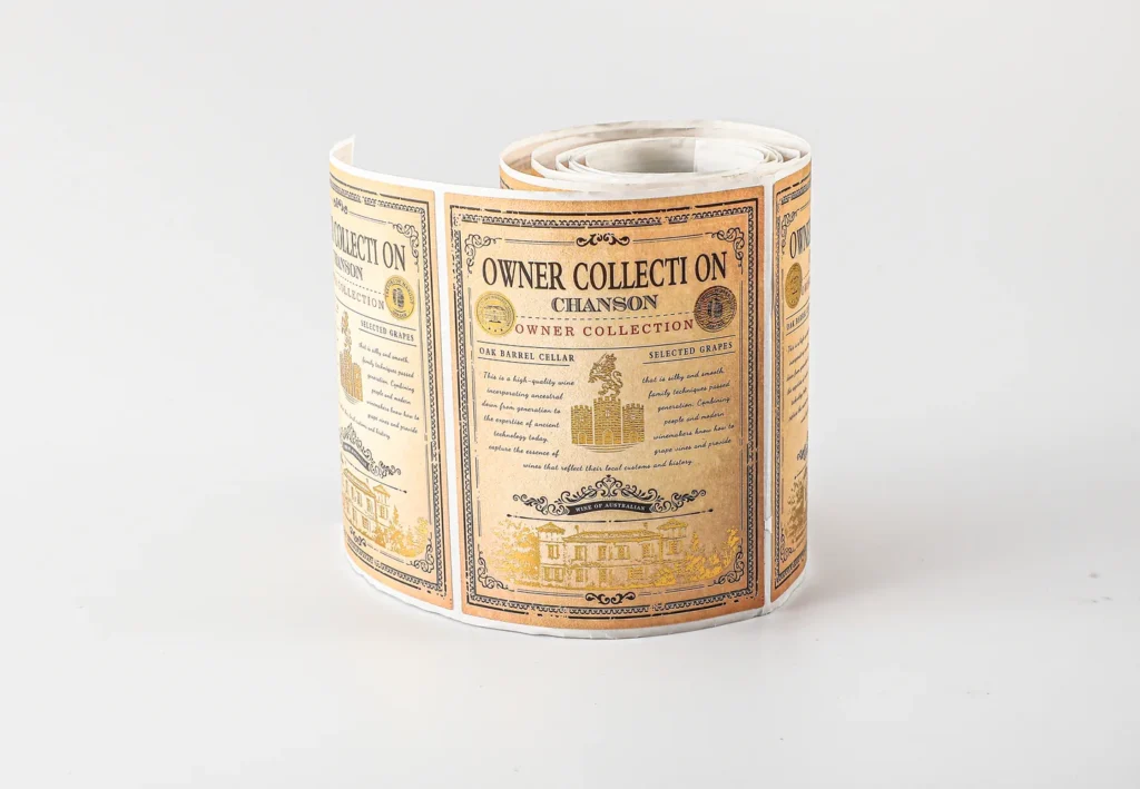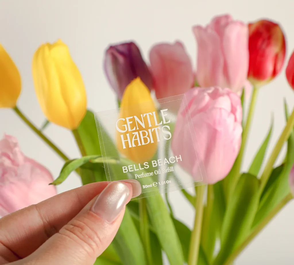
For clear-label artwork, identify three areas separately: parts that remain transparent, parts printed in white, and colored parts that need a white backing. A white shape in a screen preview is not enough to specify these choices. Send a marked reference and approve the printer’s white-ink separation before production.
Transparent packaging makes the container and its contents part of the visual result. This guide covers white-ink planning for custom clear labels. Use the broader packaging artwork checklist for dielines, fonts, image quality and version control.
- A clear area, a white printed area and a color over white need different instructions.
- Review the artwork against the intended container and contents.
- Ask the printer how to name and supply the white separation.
- Check a physical sample when opacity or printed color is a purchasing requirement.
What does white underprint do on a clear label?
White underprint provides a backing beneath selected printed colors. It reduces how much the background influences those areas. Leaving other areas without white preserves the intended transparent effect. Avery’s explanation of white underprint illustrates this distinction on clear materials.
Opacity is a sample approval question. The ink system, coverage and proposed construction need to produce the appearance your project requires. An image on a white monitor background cannot demonstrate the result on a dark bottle or behind a colored liquid.
1. Mark the three artwork zones
Give every important area an explicit printing instruction. A designer can mark a reference copy in contrasting colors and include a short legend. Keep that explanatory copy separate from the production artwork so the notes do not become printable graphics.
| Intended appearance | Instruction to agree | What to check on the proof |
|---|---|---|
| Transparent window | Leave this area clear; identify whether any transparent color is intentional. | No unintended white backing or background rectangle. |
| White lettering or symbol | Print white in the marked shape. | The shape appears in the white separation, including small details. |
| Color with a white base | Place white behind the selected colored artwork. | White coverage matches the intended region and the approved edge treatment. |
| Translucent colored effect | Leave white out of the marked colored region. | The design intentionally allows the background to influence that area. |
Use a revision name shared by the artwork and marked reference, such as the product SKU plus a revision number. If a white rectangle is intended behind text, label it explicitly. If it is only the artboard background, say so.
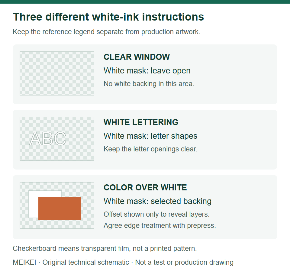
A white-ink handover example
Describe each zone in words as well as on the marked artwork. This illustrative brief shows the decisions to send; it is not a customer case or an approved print specification.
| Field | Example instruction |
|---|---|
| Viewing condition | Outside of a clear bottle; artwork viewed from the printed face. Assess with the actual filled bottle. |
| Window A | Leave clear; no white and no color. |
| Lettering B | Print white only; keep the enclosed letter openings transparent. |
| Color panel C | Print the selected color with white backing. Prepress to propose edge treatment for approval. |
| Approval | Review the separate white mask and combined proof, then assess a sample on the bottle. No measured opacity requirement has been supplied yet. |
If the labels will be machine applied, confirm the roll construction and label unwind direction separately. A correct white mask cannot correct a roll that feeds the label sideways.
2. Review the container as part of the design
Review on the intended pack, in its relevant filled condition. Provide a container photograph for orientation and a physical reference when needed. Identify the label position, the normal viewing direction and any product variants that create a different background.
For example, two variants may use identical clear bottles but different colored contents. Ask the designer to check the text and image areas for both variants. This is a planning scenario, not evidence of a measured printing outcome. If the label is meant to be read through a transparent container, confirm the viewing side and print orientation before making the file.
The cover photograph shows white lettering and clear areas in a supplied sample. It demonstrates that visible design choice; it does not establish an opacity value, adhesive grade or suitability for your container.
3. Agree the white-ink file setup with the printer
Request the printer’s separation instructions before exporting the final file. Agree the spot-color name, layer naming, file format and which party prepares the white mask. These are production-workflow choices, so a naming convention taken from another printer should not be assumed to apply.
Avery’s artwork guidelines, for example, specify a separate spot-color treatment for its white underprint and show the white area separately on the proof. Use that as an illustration of explicit separation, not as MEIKEI’s required spot-color name.
- Keep the cutting path distinct from printed colors and white ink.
- Identify white-only objects as well as any backing behind colored artwork.
- Flag transparent holes within lettering or logos that must remain open.
- Have prepress confirm how white and color meet at edges; do not apply an arbitrary offset from an unrelated job.
- Supply the approved revision alongside a visual reference explaining the intended result.
A flattened mockup can help communicate appearance but may not contain editable separation data. If that is the only file available, include it in the inquiry and ask what artwork preparation is needed before print approval.
4. Review the white proof and the physical result
Approve both the intended mask and the appearance it produces. On the proof, compare the white-only view with the combined artwork. Check that transparent areas remain open, white lettering is present, and the correct file revision is shown.
Avery’s proof guidance also explains that screen color is an approximation of print. Where appearance is important, assess the proposed finished sample on the actual container. Record readability, color appearance, visible white edges and the effect of the background. Keep these observations with the approved construction and artwork revision.
For a barcode or other machine-readable mark, state its required verification separately. A design that looks attractive in a photograph has not thereby passed a scanning or print-quality requirement. Use your responsible barcode reviewer and the sample approval record to document the decision.
5. Connect the artwork decision to a quote
Send the finished label size, container details, quantity per artwork and marked white/clear reference. Specify whether you need roll supply or sheet supply, and include the application and handling requirements. White-ink artwork does not settle material or adhesive suitability.
MEIKEI’s label MOQ is 100 individual labels. Upload the files you have with your product specification and identify what still needs design or prepress work. For coordinated labels and cartons, include separate component files and use a common approved brand reference.
Clear-label artwork questions
Does white in a PDF automatically become white ink?
No. The production workflow must identify which objects print white and which areas remain clear. Confirm the separation with the printer instead of relying on the PDF’s screen appearance.
Can a home inkjet reproduce a professional white-ink proof?
An ordinary home inkjet does not print white ink, as Avery’s print-white guidance explains. Such a print can help review layout, but it cannot approve the proposed white-ink result.
Should every colored area have white behind it?
That depends on the desired appearance. Mark the areas intended to look more opaque and those intended to remain translucent, then review a sample of the agreed construction.
Published by MEIKEI Printing as general packaging planning guidance. Material suitability, product performance and production details must be confirmed for your actual specification. Linked technical references support the relevant points; illustrations are not test evidence.