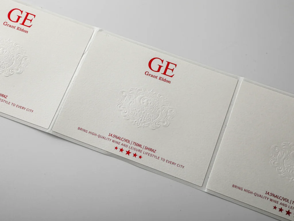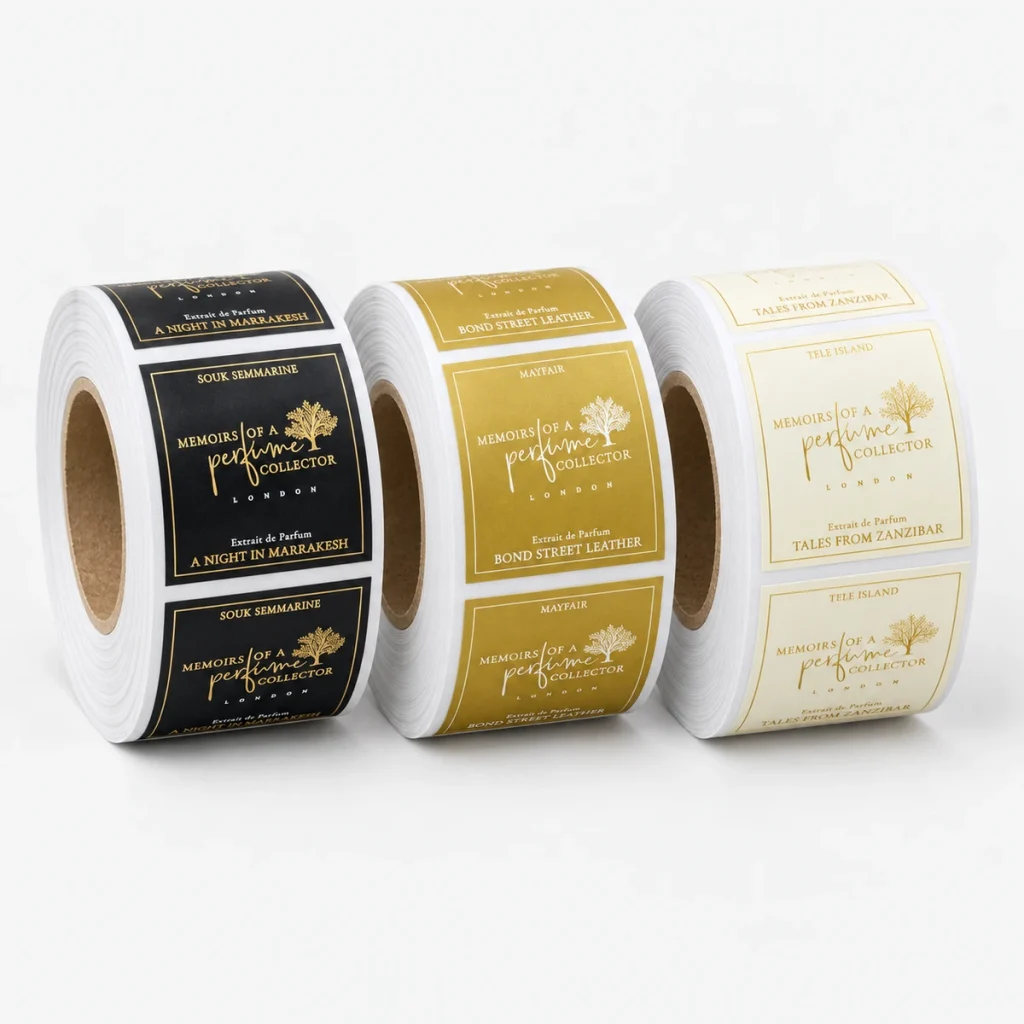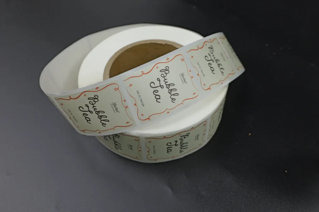
A textured paper label should be specified as a complete construction: paper face, adhesive, liner, print and finish. “Cream textured paper with a gold logo” describes the appearance, but leaves important production decisions open.
For wine, spirits, cosmetics and other packaged products, start with the container and its use conditions. Then choose the paper surface and decorative effects. This guide explains what to compare before ordering custom printed labels, using a real photograph from MEIKEI’s sample library and named supplier guidance.
Before requesting a quote
- Identify the paper grade and thickness, not just the word “textured.”
- Describe the container, application method and expected moisture exposure.
- Specify foil and embossing separately from the printed artwork.
- Approve the decorated label on the actual container before committing to production.
What makes a paper label textured?
Texture describes the face of the paper, while embossing describes a selected design formed into relief. A textured stock can provide a tactile background without a raised logo; a smoother stock can carry a deliberately embossed design.
For comparison, ask for physical swatches with the same printed artwork. Check whether you prefer the background texture, the printed detail or the relief effect. Those choices can lead to different specifications.
Request the paper’s manufacturer and grade, shade, basis weight, thickness and any coating information. Keep adhesive and liner details in the same specification so future discussions refer to a complete label construction.
If you are still deciding between paper and a film material, use the broader BOPP versus paper labels comparison first.
What can we learn from a real printed label sample?
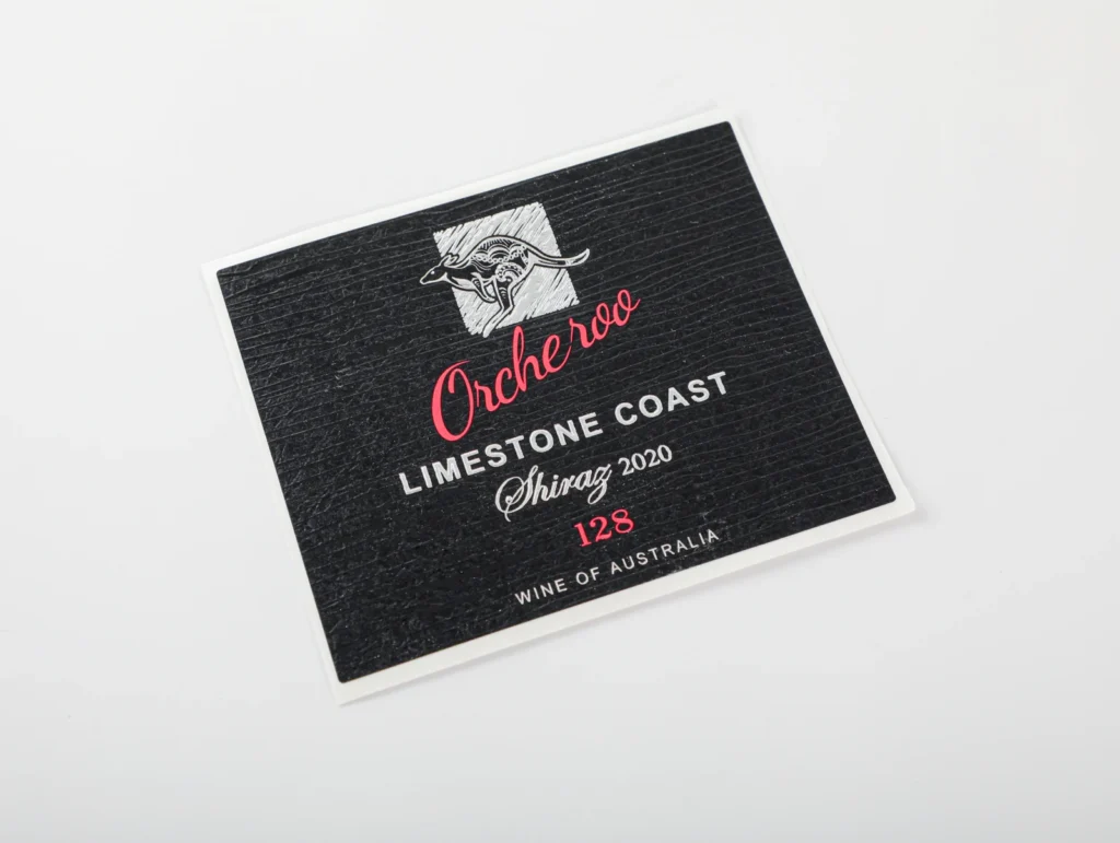
The sample photograph shows a black paper wine label with visible horizontal surface texture. Red lettering and white artwork sit over the textured background, making it useful for discussing contrast, fine detail and the appearance of the paper face.
Use those visible details to make a practical review list:
| Visible detail | What to examine on the physical sample |
|---|---|
| Horizontal texture across the black paper face | Does the surface pattern and feel match the approved physical swatch? |
| White illustration and small lettering | Are fine lines and counters clear against the textured background? |
| Red lettering on a dark background | Is the contrast and color appearance acceptable under the agreed viewing conditions? |
| Large dark areas between the artwork | Is the appearance consistent across the ridges and recesses of the selected stock? |
| Margin around the label artwork | Is the artwork positioned correctly for the agreed finished size and cut shape? |
The photograph is a sample reference, not a record of a customer’s order or a performance test. It does not establish the paper grade, adhesive chemistry, finishing method or suitability for refrigeration. Those details belong in the production specification.
When sending a reference image, point to the feature you want: the background feel, lettering, metallic appearance or relief. “Make it like this” is less useful than identifying which part should match.
Which paper specifications matter beyond GSM?
Basis weight and thickness answer different questions. Ask for both, then check the supplier’s application notes.
Avery Dennison’s 2024 ANZ Product Component Guide lists its Vintage FSC facestock at 110 g/m² and 130 µm. The same entry describes a textured, moisture-protected paper and warns against neck labels or tight-radius applications because of its stiffness. Those figures identify that particular supplier grade; they are not a recommended range for all textured labels. Avery Dennison guide, printed page 66
This example shows why selecting a paper by “110 GSM” alone is incomplete. Ask whether the proposed construction suits your bottle diameter, label size, adhesive and application method. A material suitable for a broad bottle body should not be assumed suitable for a narrow neck.
The cited grade is a technical reference, not a statement that MEIKEI stocks it or supplies a certified construction. Material sourcing and any required documentation should be confirmed with the quotation.
Can textured paper labels have foil stamping?
They can, when the chosen stock, transfer material and production process are compatible. Treat the foil specification as more than a color name.
KURZ identifies surface roughness as a factor in hot-stamping setup. It also explains that contact time, heat and equipment affect the transfer process. That is a reason to sample the combination, not to adopt one temperature or pressure setting for every textured paper. KURZ hot-stamping guidance
For the artwork review, identify:
- The exact areas intended for foil.
- Whether the appearance should be highly reflective, softer or pigmented.
- Fine lines, small gaps and large solid areas that deserve separate inspection.
- The intended relationship between foil, printed color and relief.
- Whether the quoted sample includes the final decorative process.
Ask the supplier to confirm the smallest practical features for the proposed construction. Do not substitute a line-width rule taken from a different printer, material or machine.
Can embossing change how the label performs?
Yes; the decorated construction needs its own review. A material’s suitability before finishing does not automatically prove the finished label’s performance.
For Vintage FSC specifically, Avery Dennison’s guide warns that high levels of embossing can affect the moisture barrier and adhesion or tight-radius performance. Keep that warning attached to the named material rather than presenting it as a measured result for all papers.
For the proposed order, identify the relief areas and ask the converter to review them against the label shape and application. Request a sample with the intended finishing process. A plain unprinted swatch is useful for choosing a surface, but it cannot show the result of the completed design.
Sappi’s prepress guide also recommends supplying a reference for the intended finishing effect and checking the paper’s weight and finish when planning an emboss. Sappi: preparing files for print, printed page 9
Are textured paper labels waterproof?
Do not assume water resistance from the appearance of the paper. Ask how the complete label is intended to behave under the actual exposure.
Describe the difference between dry shelf display, occasional splashes, condensation, refrigerated storage and immersion. “Waterproof” is too broad to serve as the whole approval brief.
Agree what the sample review should cover: paper appearance, printed detail, decorative finish and attachment to the container. Specify the exposure and observation conditions with the supplier. A successful check under one set of conditions is not an unrestricted performance claim.
For products used cold or exposed to condensation, follow the more detailed refrigerated-label selection guide. If paper is unsuitable for the intended conditions, discuss a different construction before approving the artwork.
How should the adhesive and supply format be specified?
Name the container material and describe the area receiving the label. Include the shape and whether the label crosses a taper, seam or other change in surface.
Tell the supplier whether application is manual or by machine. For machine application, supply the available label and liner dimensions, roll core, maximum roll diameter and required direction. These details belong alongside the artwork, not in a separate last-minute message.
MEIKEI’s custom roll labels page covers the production options. The label unwind direction guide helps you describe the roll orientation to the printer and equipment operator.
Do not choose an adhesive solely because it is described as “strong.” The relevant question is whether the specified label construction suits the actual container, application and use conditions.
What should you send for an accurate quotation?
Send one consistent brief that joins the visual reference to the production requirements.
| Item | Information to provide |
|---|---|
| Product and container | What is being labeled, container material and shape |
| Label size | Finished width and height, units and cut shape |
| Paper preference | Swatch or reference; proposed grade if already selected |
| Print and finish | Artwork, color references, foil areas and relief areas |
| Quantity | Individual labels required, split by artwork version |
| Application | Manual or machine; roll specification when applicable |
| Use conditions | Storage, handling and relevant moisture exposure |
| Delivery | Country, postcode and required arrival date |
A photograph can accompany the brief, but should not replace the artwork or dimensions. Where a choice is unresolved, explain the requirement and ask for a recommendation rather than guessing a material name.
How do you approve the sample?
Approve the label as it will be used. Keep a reference to the sample, artwork revision and confirmed construction so changes are visible later.
Start by comparing paper shade, smallest text, decorative coverage and alignment. Apply the finished label to the actual container, then review it under the conditions agreed with the supplier. Record what was observed and what still needs adjustment.
Separate a request for a different appearance from a production defect. For example, “we prefer a quieter background texture” is a design change; a mismatch against the approved artwork is a different issue. Making that distinction helps the next sample answer the right question.
Request textured paper label samples for your project
Send the container details, dimensions, artwork, quantity and delivery country. Tell MEIKEI which feature matters most: paper texture, metallic detail, raised artwork or suitability for a particular use.
The starting minimum is 100 individual labels. The quotation confirms the material, finishing process and job requirements; a reference photograph is a useful starting point when the specification is still open. Discuss your textured paper label project.